
Bang, Pop, WOW -- How to Use Bold Colors
By: Alicia Hall, Strategic Communications Intern, Nest with the Nelsons
Tired of only using neutrals and want to brighten your space? Pops of color are a great way to zhuzh up your home! With the pandemic keeping everyone homebound for the past couple years, you may feel it’s time to experiment with a new color palette. Any good designer will mention that neutrals are a great option for a simplistic and a cohesively stylish design. However, if you want to add more character with a more forward-looking style, incorporating pops of color into your home can be an asset to your dream design.
It’s possible that you’re afraid to use bolder colors because you don’t know where to start – we get it. But, don’t sweat it! Adding pops of color in your space doesn't mean you need to get rid of the comfort of your neutrals. Colors that are more lively can be complementary to what you already love - it’ll just add more flare and charm! This article will offer ways that you can incorporate pops of color into your home and how it can be the perfect solution to livening up your room.
Embracing Bold
If you want to embrace a new look with bold colors, but also love the idea of a neutral backdrop - you’re in luck! Well-curated designs can have elements of both neutrals and more daring shades. It’s just a matter of how you execute your vision. Embracing the bold and finding ways to integrate it into your space can give any home a fresh new energy! It can renew a space that may feel boring or lackluster by drawing points of interest.
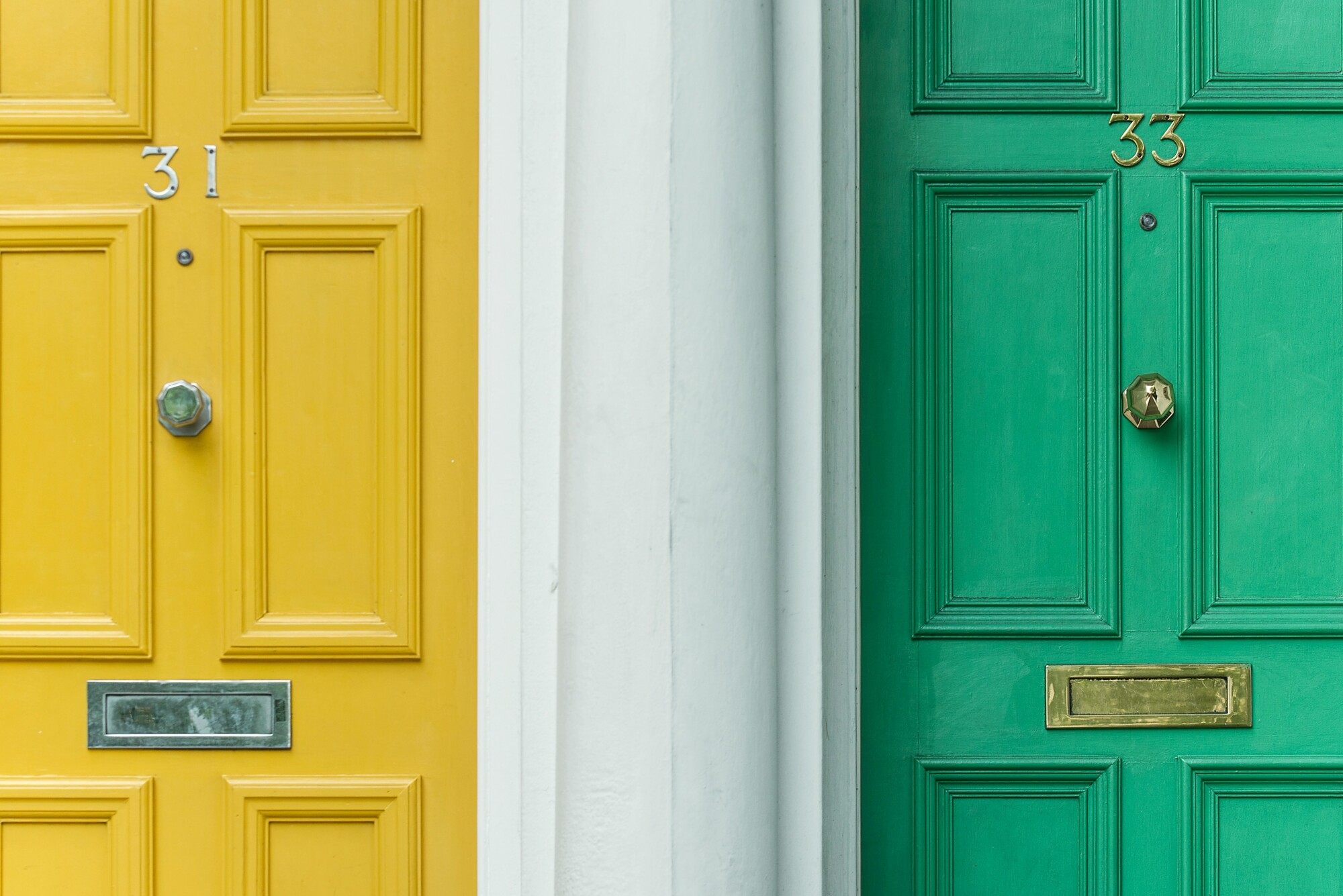
Though neutrals bring cohesion, livelier colors can make a statement that will brighten up a room. Playing with different colors also has an effect on human perception. Colors like yellow and orange will promote feelings of happiness and optimism. While colors like green and purple have a more subdued, calming effect. Whether you’re simply looking to freshen up your look or want your space to have a more uplifting presence to it, bold colors are the way to go! Megan Nelson, Co-Owner + Founder of Nest with the Nelsons, shares “Bold colors for walls, pops of color for decor, and fun splashes here and there are not going anywhere. This is a great way for people to express themselves at home, and is an easy and effective way to find joy in your everyday life.”
Choosing Colors
When finding the color that works best for you, having trust in the brand of paints you use is very important. High quality paints will be more concentrated with pigment in comparison to paints of lower quality. This will determine your color’s durability, coverage quality, uniformity, and sheen. Upon asking what Megan and her team enjoys using, she shares, “We love Sherwin Williams as they offer a wide range of color selections at an affordable price. We are also able to pass along our designer discount to clients, so that's an extra perk!” Sherwin Williams is known for a wide selection of durable paints suitable to all your color needs. The right paint for your project varies depending on your room and Sherwin Williams explains this all here.
We turn to our brand partner Cardenas Painting for all of our interior and exterior paint projects. We trust them with our clients, and even with our own home. We cannot recommend them enough! When you’re ready to elevate your home with a paint project large or small, connect with Jose at 402.850.0373, for a free estimate and impeccable work.
To get an inside scoop on colors, I asked Megan a few questions about everything bold from her favorite paints to color combinations.
What are your favorite pops of colors to use and why?
As of last year, green is my go-to. And not just any green, but a deep, rich, emerald green. Think royal tones for a deep and moody look. But, I'm also craving lighter tones of green such as Sherwin Williams Acacia Haze and Hazel for more of a trendy splash of color. Naval, a deep and sophisticated blue is also such a great color to explore.
What are the best neutral and bold color combos?
Neutrals are also here to stay, but they are coming out with different tones as of late. We're seeing lots of those beautiful sandy tans, and may even be a nod to the beige trend that was so, so very hot over a decade ago. I like to use more dramatic colors like the bold greens I mentioned in smaller spaces, or for accent walls. I then pair more neutrals like Sherwin Williams Natural Linen to balance things out and lighten them up. I'm also digging Sherwin Williams deep Naval paired with the warm white tone of Alabaster for a great contrast these days.
Would you typically combine neutrals with bolds?
I do suggest it, depending on the project, and what the client is looking to achieve. If they are looking for a splash of color, I will absolutely recommend it in the form of paint. If they are searching for more neutrals through a cozy and zen vibe, I might suggest bolder colors to come in through decor accents, pillows, throws, or a rug.
Non-Permanent Designs
If you’re unsure of a permanent design and would rather experiment with colors first, this is certainly doable! Playing with non-permanent decor pieces can help ease you into the plethora of brighter colors. This especially works great for those figuring out color combinations that work well with your mood. Non-permanent decor can include bold photography or wall art to flowers and candle holders.
Like Megan advised, you can also have decor accents that come from your pillows, throws, or rugs. These are great alternatives to developing your taste in design. If you’re feeling a bit more daring, you can even paint the inside of your bookshelves an exciting color or apply self-stick wallpaper! This certainly will call for a more subtle, but charming flare. The more you play dress up with your space, the more you’ll feel confident in your decor exploration.
I hope you enjoyed this article on how you can spice up your home with a few bold pops. If you want to share your fun and dazzling designs please tag us on @nestwiththenelsons. We’d be happy to see the colors that make your day (and your home!) shine bright!
Color is just one piece of the home decor puzzle. When you're in need of some guidance, suggestions, or you just need someone with an eye for design to bounce ideas off of, Nest with the Nelsons is here to help. Schedule your totally free 15-minute consult today!
Have a great week ahead, and talk soon!!
Megan Nelson, Co-Owner + Founder
Nest with the Nelsons
nestwiththenelsons.com
nestwiththenelsons@gmail.com
Nest with the Nelsons
nestwiththenelsons.com
nestwiththenelsons@gmail.com
Love your home again with our must-have resources ...
1. Subscribe to our email list to unlock even more of our must-see design tips.
2. Join the Love your Home Again Facebook Group. We share all sorts of great home design and home organization tips and tricks there.
3. Book a FREE 15-minute consultation with yours truly. We’ll get to the bottom of the design dilemmas that might be holding you back from your dream interior design.
4. Are you a business owner looking to reach new customers? Check out our Brand Partners page to learn about our brand partner opportunity and secure an exclusive spot with us.